 Support & Knowledge
 Updates
 Real Estate Blog
 Open Platform
 Affiliates
 MLS Coverage
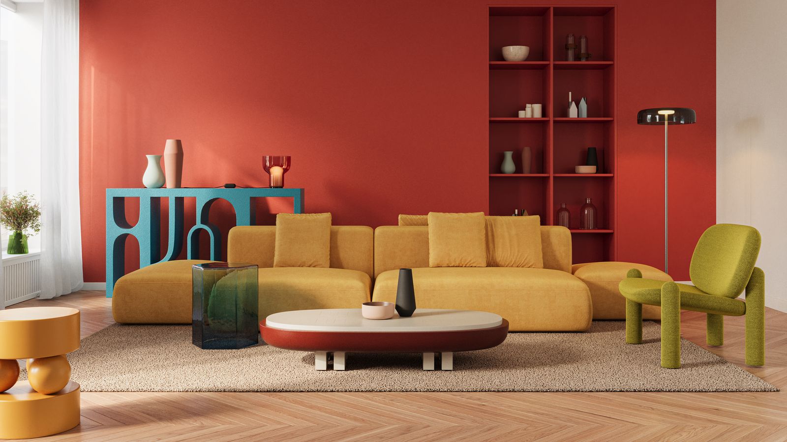
Learn the fundamentals of color psychology for real estate, including how color choices impact user experience, trust, and lead conversion.
Branding & Design
The colors on your website, in your listing photos, and across your marketing materials trigger instant emotional responses that influence whether buyers trust you, click your buttons, or remember your properties days later. Most agents choose colors based on personal preference or what looks trendy, missing the psychological leverage that top producers use to convert more leads with the same traffic.
This guide breaks down how different colors affect buyer behavior, which palettes build trust versus urgency, and how to apply color psychology across your digital presence and staging without needing a design degree.
How Color Choices Influence Buyer Emotion And Action
Colors trigger immediate emotional responses in the brain before conscious thought even occurs. In real estate, color choices affect three critical buyer behaviors: trust formation, decision speed, and memory retention.
Blue tones activate brain areas associated with calm and reliability, which explains why so many professional service providers use blue in their branding. Red tones stimulate the part of the brain linked to urgency and excitement, which is why clearance sales and limited-time offers almost always feature red.
The effects extend beyond digital marketing into physical spaces too. Buyers touring a home with warm, inviting colors in the living areas report feeling more emotionally connected to the property than those viewing identical layouts painted stark white.
Emotional Impact of Core Colors on Homebuyers
The emotional responses that colors trigger directly affect how buyers interact with your marketing and whether they move forward in the sales process. These reactions happen automatically before logical thinking kicks in, which gives you an opportunity to create the right emotional environment for decision-making.
Warm Hues and Urgency
Warm colors like reds, oranges, and warm yellows create feelings of excitement and encourage quick decision-making. They literally warm up the perceived temperature of a space by a few degrees in the viewer’s mind, which can make a room feel cozier or more energetic depending on the shade.
These hues work best when you want to create momentum and push buyers toward action. However, too much warmth can feel aggressive or overwhelming, especially in digital spaces where people are already overstimulated by content.
Use warm colors for call-to-action buttons that need immediate clicks, limited inventory or time-sensitive offer announcements, accent walls in social spaces like dining rooms, and small pops of color in otherwise neutral marketing materials.
Cool Hues and Trust
Cool colors including blues, greens, and purples build confidence and encourage longer, more thoughtful engagement with your content. They lower perceived stress levels and create an environment where buyers feel comfortable exploring options without pressure.
These tones work exceptionally well for establishing your credibility as a trusted advisor rather than a pushy salesperson. Buyers spend more time on websites and in homes that feature calming cool tones because they feel psychologically safe to take their time and consider their options.
Apply cool colors to elements where you want buyers to slow down, read carefully, and build trust in your expertise and services. This is particularly important for contact forms, about pages, and any content where you’re asking for personal information.
Neutrals and Sophistication
Whites, grays, beiges, and other neutral tones create perceptions of premium quality and allow other elements to take center stage. They’re the foundation that makes everything else in your design work more effectively, like a blank canvas that lets the art shine.
Neutrals appeal to the widest possible audience because they don’t trigger strong emotional reactions that might alienate certain demographics. This makes them ideal for primary branding elements and spaces where you want buyers to project their own vision rather than seeing someone else’s style.
Luxury real estate marketing relies heavily on neutrals because they signal refinement without dictating a specific taste preference. When a buyer can envision their own furniture and life in a space, they’re more likely to make an offer.
Applying Color Psychology to Real Estate Websites and Branding
Your website is often the first impression potential clients have of your business, making color choices critically important. The right palette builds trust within seconds, while poor color decisions can make visitors leave before they even see your listings.
Brand Palette Selection
Start by identifying the primary emotion you want clients to associate with your brand. Choose one primary color for your main branding elements, one secondary color for accents and calls-to-action, and two to three neutral colors for backgrounds and text. Test these combinations across different devices and lighting conditions before finalizing your choice.
At AgentFire, we’ve helped thousands of agents develop brand palettes that convert visitors into leads by applying color psychology principles to every element of their websites. The difference between a generic color scheme and a strategic one often means the difference between a visitor bouncing or booking a consultation.
IDX and Search Highlights
Property search tools need color choices that guide the eye without overwhelming users who are comparing multiple listings. Use your primary brand color sparingly to highlight favorited properties or saved searches, keeping the focus on the property photos themselves.
Keep the main search interface neutral with high contrast so property photos remain the visual focus. Reserve your accent colors for interactive elements like “save this search” buttons or “schedule a showing” calls-to-action that move buyers forward in the process.
The goal is making the search experience feel intuitive while subtly guiding users toward conversion actions through strategic color placement. When done right, buyers don’t consciously notice the color strategy but they follow the path you’ve created.
Contrast and ADA Compliance
Accessible design isn’t optional anymore, and fortunately you can meet Web Content Accessibility Guidelines while still applying color psychology effectively. The key is ensuring sufficient contrast ratios between text and backgrounds so everyone can read your content.
WCAG standards require a 4.5:1 contrast ratio for normal text and 3:1 for large text. You can use psychologically effective colors like blue or green while adjusting their brightness to meet these requirements without sacrificing visual appeal.
Tools like WebAIM’s Contrast Checker let you test your color combinations quickly to ensure they work for all visitors, including those with visual impairments. Meeting accessibility standards actually improves conversion rates because more people can easily read and interact with your content.
Using Color Moods in Home Staging and Listing Photos
The colors present in listing photos and staged homes directly impact how quickly properties sell and at what price point. Strategic color choices help buyers emotionally connect with a space before they ever visit in person, which is critical in today’s digital-first market.
Exterior Paint Strategies
Exterior colors create the crucial first impression that determines whether buyers even want to see inside. Neutral exteriors with strategic accent colors on doors or shutters appeal to the widest buyer pool while still showing personality and curb appeal.
Research shows that homes with black or charcoal gray front doors sell for approximately $6,000 more than expected, while pale blue doors can add around $1,500 to sale prices. These colors photograph exceptionally well online, which is where most buyers first encounter your listings.
Avoid trendy exterior colors that might not photograph well or that date the property in buyers’ minds. Stick with classic choices that have broad appeal and will look good in listing photos across different lighting conditions.
Interior Accent Walls
A single accent wall in a warm, inviting color can transform a bland space into a memorable one that buyers recall days later. The key is choosing colors that highlight architectural features or create focal points in otherwise neutral rooms without overwhelming the space.
Deep blue accent walls in home offices convey productivity and focus. Warm terracotta or sage green in living spaces creates cozy gathering areas that feel designed rather than empty.
Keep accent walls to one per room maximum to avoid overwhelming the space and diluting their impact. The surrounding walls in neutral tones allow buyers to envision their own furniture and style while the accent wall provides just enough personality to make an impression.
Virtual Staging Color Tweaks
Digital staging tools now allow you to adjust wall colors, add colorful furniture, and test different color schemes without physical changes. This lets you target different buyer demographics with customized listing presentations that speak to their specific preferences.
Just verify that any virtual staging clearly discloses that images are digitally enhanced to maintain trust and comply with advertising standards. Transparency builds credibility even when you’re using technology to enhance presentation.
Color Psychology Tips for High-Converting Digital Ads and CTAs
The colors you choose for buttons, banners, and promotional graphics directly impact click-through rates and conversion performance. Small color changes can produce dramatic differences in results, which makes testing different options worthwhile.
Button and Link Color Tests
Your call-to-action buttons compete with every other element on the page for attention, and color is your primary tool for making them stand out. The button color doesn’t matter as much as the contrast between the button and its surrounding elements, which is why a red button might work great on one page and fail on another.
Orange and red buttons often perform well because they create urgency and stand out against common website backgrounds. Green buttons work effectively when you want to convey a positive, low-risk action like “get your free report” or “calculate your home value.”
Test different button colors with your specific audience rather than following generic advice. What works in one market or for one demographic might not work for yours, and the only way to know is testing real performance data.
Social Media Graphic Palettes
Social media feeds move fast, and your graphics need to stop the scroll immediately. High-contrast color combinations with one bold accent color perform best in crowded feeds where you’re competing with hundreds of other posts.
Keep your brand colors present but don’t be afraid to use trend-forward color combinations that feel native to each platform. Instagram audiences respond to cohesive, aesthetically pleasing palettes, while Facebook users engage more with high-contrast, easy-to-read graphics.
Email Banner Optimization
Email inboxes are cluttered, and your header image needs to communicate value in the split second before someone decides to delete or read. Use your primary brand color in the banner to build recognition over time as people see your emails repeatedly.
Reserve bright accent colors for the single most important element in each email, whether that’s a property photo, a call-to-action button, or a key statistic. Multiple bright colors in one email dilute attention and reduce click-through rates because the eye doesn’t know where to focus.
Put Color Psychology to Work in Your Business Today
Color psychology gives you a powerful tool for influencing buyer emotions and decisions across every marketing touchpoint. The key is applying these principles strategically while maintaining your authentic brand voice rather than following formulas that make you blend in with competitors.
Start by auditing your current color choices across your website, marketing materials, and staging approach. Identify where your colors might be working against your goals or where strategic changes could improve performance without requiring a complete rebrand.
Test different color approaches in your digital advertising and track the results to see what resonates with your specific audience. What works in one market might not work in another, so let your data guide your refinements rather than generic best practices.
Ready to build a website that uses color psychology to convert more leads? Book a demo with AgentFire to see how our brand-focused designs can help you stand out and win more business.
FAQs About Color Psychology in Real Estate
Does color psychology actually increase listing engagement and buyer interest?
Color psychology can influence buyer emotions and decision-making, but results depend on proper implementation and audience understanding. The impact works best when combined with strong content, professional photography, and excellent user experience rather than as a standalone tactic that magically transforms results.
Which website colors generate the most contact form submissions from potential clients?
Blue and green typically perform well for trust-building elements like contact forms because they convey reliability and professionalism. Orange and red can be effective for urgent action buttons, though the best performing colors vary by market and demographic, which means testing with your specific audience provides the most reliable answers.
How many brand colors should a real estate team use without overwhelming clients?
Most successful real estate brands use two to four core colors plus neutral tones for backgrounds and text. This provides enough variety for different purposes while maintaining consistent brand recognition across all marketing materials and touchpoints, making your brand memorable without becoming visually chaotic.
Can real estate agents apply color psychology while meeting accessibility contrast requirements?
Yes, you can use psychologically effective colors while meeting WCAG accessibility standards by adjusting saturation and brightness levels. Many color combinations achieve both psychological impact and sufficient contrast ratios when properly implemented, and free tools like WebAIM’s contrast checker make testing quick and easy without requiring design expertise.