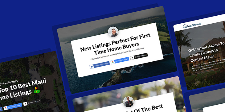
Convert your hard-earned website traffic into actual clients with these landing pages essential elements. Learn why they need to be included in your page and why.
Branding & Design Technology
A real estate landing page, also referred to as a lead capture page or squeeze page, is a dedicated webpage meant to serve a specific goal.
Your landing pages are separate from the other pages on your website and viewers can only access it by clicking on an advertisement or a link. For example, imagine that you click into an ad for a condo in Tampa and you are guided to a real estate agent’s home page. You’d probably feel conned and frustrated that you have to now scour the website to find the listing that initially got you so excited. Landing pages make it easy for users to get to the exact, often temporary, item on your website that they are looking for.
In this blog, we often talk about the importance of content marketing, attracting more high-quality traffic towards your website, and reaching out to your sphere of influence for more leads.
But once you start attracting a sizable amount of traffic your way, and your social media inboxes start to overflow with new subscriber notifications, what happens next?
How do you convert that hard-earned traffic into actual leads, and eventually into closed transactions?
A great tool to help you bridge visitors to clients is a landing page.
What Is A Landing Page?
Think of your website homepage as home base. This is where someone will likely land first if they are searching up your name, business, or a related keyword. Your homepage should tell users a bit about your real estate business, the areas you serve, and help them to find more specific pages on your website.
Each landing page, on the other hand, should be highly targeted to a specific audience, with a single goal in mind. The high-converting landing page drives clicks through a clear and powerful call to action (CTA). Each landing page, on the other hand, should be highly targeted to a specific audience, with a single goal in mind. After all, the goal is to get users closer to becoming a client.
If you’ve ever filled out an online form with your email and name to get a free guide or other forms of freebies, then you’ve seen and/or used a landing page. Unlike a homepage, which welcomes new visitors to your website and gives them a menu of options of where to go to find what they need, a landing page is created with a single purpose in mind: conversions.
Having said that, it should now be clear that creating a landing page that actually produces results follows different rules than creating a regular web page, or an email newsletter.
Certain time-tested guidelines can help you maximize your landing page’s chances of success, and we will go over them in this article.
Why Create Real Estate Landing Pages?
We’ve already briefly touched on the benefits of high-converting landing pages. Now let’s go a bit deeper and examine how real estate landing pages, specifically can welcome site visitors, generate leads, and motivate a potential buyer, among other functions.
Maximize ROI and Adspend
If you are investing in your digital marketing efforts financially and temporally, you want to see results. Landing pages allow your audience to see the value in what you can offer to them and increases the odds that these leads will convert.
Develop and Grow Your Email List
Using lead capture forms on your real estate landing page, you can gather the email addresses of prospective clients so that you can add them to your lead pipeline going forward.
Showcase Properties in Detail
Single-property websites allow agents to show their listings off and deliver the valuable information a viewer is looking for without needing to put in the extra work.
Create Urgency
Landing pages are more useful for creating a sense of urgency about deals and hot listings than a home page. For example, your landing page can urge someone to subscribe to your email newsletter or trade their contact information in exchange for access to private listings.
Accurately Measure Campaign Results
You can track the success of your campaigns by analyzing the page views, bounce rate, and conversion rate of landing pages you have set up for that specific campaign. How many viewers ended up going to your landing page? And how many of those page visitors took action based on the CTA and made the next step?
What’s The Specific Call-To-Action (CTA) Of Your Landing Page?
While the ultimate goal of any and all of your marketing efforts is to get more buyers or sellers under contract, it’s not realistic to expect that any single piece of marketing will suddenly change the mind of someone who just found out about your business into a client. Sure, it CAN happen, but it’s unlikely to happen regularly.
The same can be said about your landing page. Unless you’re dealing with a person who’s pretty much ready to make a purchase decision already, you shouldn’t expect that as soon as a visitor arrives at your page, they will suddenly become overcome by a desire to buy or sell a home.
Instead, a more realistic expectation for your landing page is that it will help push your visitors one step closer to buying or selling a home and using you as the agent to represent them.
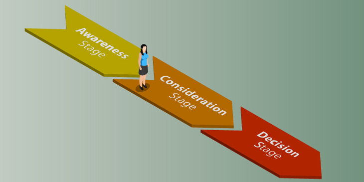
It’s essentially the same idea as facilitating a transition on your visitor’s buyer’s journey (you can find more details about the buyer’s journey in this article).
To do that, you create a landing page with a specific CTA that will facilitate their transition along their buyer’s journey. What kind of CTA?
Here are a few examples:
- A sign-up form that will add visitors to your mailing list/ newsletter
- A calendar form that will schedule a one-on-one meeting with you
- A form that requests their home’s address and contact information so you can do a property analysis
- A button that subscribes them to your social media accounts
As with everything marketing, remember that you really can’t force people to do what you want. You can only encourage and facilitate them to take the action you want and eliminate as much friction as possible that may prevent them from taking the action you want them to take.
Real Estate Landing Page Best Practices
The key to creating a real estate landing page that caters to your business’ and your clients’ needs is to start by thinking from your clients’ point of view. What are they looking for when they reach your page? What high-value information can you provide them in a visually appealing way? What type of CTA would motivate them to take action?
The following categories are a result of our own research and a great starting point if you’re not yet sure how to answer the questions above.
Make a Clear Offer
What do you want this particular landing page to do? Are you after introductory phone calls? Showings? Referrals?
Think about what you can offer in return for this information. Some ideas include neighbourhood guides, tips for new home buyers, local market updates, etc.
Your offer must be useful to your audience and valuable enough that they are willing to exchange what you request. For example, if your ad and landing page are about selling your first home, don’t waste their time by offering a home buying guide.
Create a Sense of Urgency
We spoke about why landing pages create urgency, now lets dive into the how. There’s nothing like a limited sneak peak or exclusive access to get prospects excited. Think about how a time-sensitive offer that doesn’t quite get on your home page could be better suited for your homepage.
Keep It Simple
Keep the text content short and intentional, while still providing enough info about the value of your offer. Don’t bury the main point of your landing page in loads and loads of text. Clear, plain language sets an expectation and earns the trust of your clients. This is especially important when communicating important details such as price and location.
Your call to action should be clear and have an accompanying lead capture form. The fields in these forms should be as simple as possible to make sure that visitors don’t abandon the page after deciding it’s too much of a time commitment.
Test Your Headline
Your landing page headline is the first thing that visitors will see, so make sure that it captures their attention and is easy to understand. Headline analyzer tools or ChatGPT can give you tips on how to improve your headline if you need a bit of extra help.
Optimize Landing Pages for Mobile
In the United States, over 80% of internet users are accessing the internet through mobile. In general, mobile traffic has grown over 75% in the past ten years.
Your landing pages must be optimized for mobile if you want as rich an audience as possible. Double-check all of your landing pages on desktop and mobile before making them live.
Elements Of A Successful Landing Page
Every landing page is different, and what may work for one industry, real estate niche, or individual real estate agent may not work for you. However, we strongly recommend that your landing page includes these 7 essential elements:
- A clear reference to your unique selling proposition (USP)
- The main headline
- A supporting headline
- An attention-grabbing visual (video or image)
- The benefits and features of your offer
- Social proof
- A call to action
Click the button below to learn more about pricing.
1. Your Unique Selling Proposition (USP)
A unique selling proposition isn’t just copywriting alchemy. It’s the special sauce that makes you different from your competition. Think of it as the answer to the question “who are you, and why should I go to you instead of your competitors?”
So what is it about you and your services that makes you better than the rest of your competitors? Is it your impressive multimedia marketing strategy? Your unstoppable top producer streak? Have you actually earned the reputation as the trusted go-to agent in your niche?
Whatever that special quality you have to offer, that’s your USP. And you should lean heavily on your USP on all of your marketing, your website, and your landing pages.
If your landing page manages to communicate your USP, your visitors will immediately recognize what you’re all about and why your services are worth looking into. And to make matters even better, your USP will also help your clients remember you.
2. The Main Headline
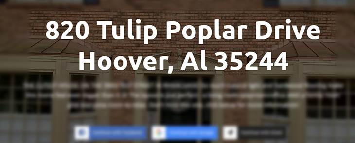
Your headline is the first piece of text your visitors will read and it sets the stage for the rest of your landing page, so a clear message that is easy to digest is vital. However, as much as we may enjoy dad jokes, puns, or pop-culture references, your main headline isn’t the place for overly creative copy. It should be functional, and straight to the point.
If the ad the linked to your landing page mentioned something such as a market trend analysis, the headline should be connected to that as well. Otherwise, anyone who came to your landing page won’t stay there for long.
Your main headline should tell your visitors what they will get out of your landing page, and if it makes sense, remind them of your USP. Keep it as punchy and short as possible.

3. A Supporting Headline
Since your main headline needs to get right to the point and inform your visitors about what they will be getting, it may not be enough to give your visitors all the information they need. This is where a supporting headline can come into play.
A supporting headline can be a short paragraph (or sub-heading) following the main headline. Its main purpose is to provide a little bit more information about your offer, and what your visitors are going to get.
However, you shouldn’t rely on your supporting headline to explain your main headline or what your landing page is all about. Your main headline should be able to stand on its own. As its name suggests, the supporting headline should support the headline.
4. An Attention-Grabbing Visual (The Hero Image)
In marketing speak, the featured, eye-catching image found near the top of the page is called the ‘hero’ image. The hero image (which can at times be a video) is the first and most prominent visual element on a landing page. As such, it should continue to carry forward the intent of the landing page, as well as your USP.
However, there’s no rule that dictates where you should place any images in your landing page. However, whatever image you choose, make sure it complements your landing page, and doesn’t detract from its message.
Include images that relate to your business and what you are offering. For example, if you are a real estate agent in a specific city, include a picture or two of your area.
Photos also visually break up text and enhance readers’ scrolling experience.
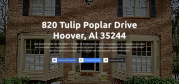
For example, if your landing page is made to promote a specific property, your hero image could be an exterior shot of the house, an immaculately staged shot of the living room, or an animated snippet of the property tour.
Instead of including an extensive gallery of the entire space, choose a walk around that takes your presentation to the next level.
A virtual tour gives viewers the flexibility to see the entire home without clicking through a million individual images. Virtual tours involve an interactive video recording showing every room that can be stopped, zoomed in and interacted with in different ways depending on the software used.
An agent walks around the place and records it, stopping along the way to showcase important details. This comprehensive video allows viewers to see the size and arrangement of the place more accurately.
5. Benefits And Features
A common truism in marketing is that whenever you promote any product of service, you should always focus on the benefits your service provides, not the features. That’s because what clients really want out of any service or product is how it will improve their lives, and aren’t just comparing features in a strictly logical and calculating manner.
And while this marketing truism is definitely a good benchmark, there’s no reason why you can’t mention both your benefits AND features.
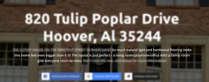
For example, in the landing page above, Allison Burleson mentions how the natural light and hardwood flooring (features) make the home feel bigger than it is (benefit). And the layout, which includes a living room, playroom office, and family room (features) gives everyone in the house enough space to relax (benefit).
6. Social Proof
“The best salesperson in your company isn’t actually the best,” said Neil Patel, one of the best digital marketers in the world right now. “Instead, the best salespeople are often your past customers. People want to hear from other people’s experience.”
Social proof is one of the most powerful tools you can use in marketing to help convince people that you are a trustworthy person. It’s the reason why companies are willing to spend millions of dollars just to get a celebrity to endorse their product in a 30-second ad. Simply put, social proof works.
On a landing page, social proof takes many forms. Some of them include:
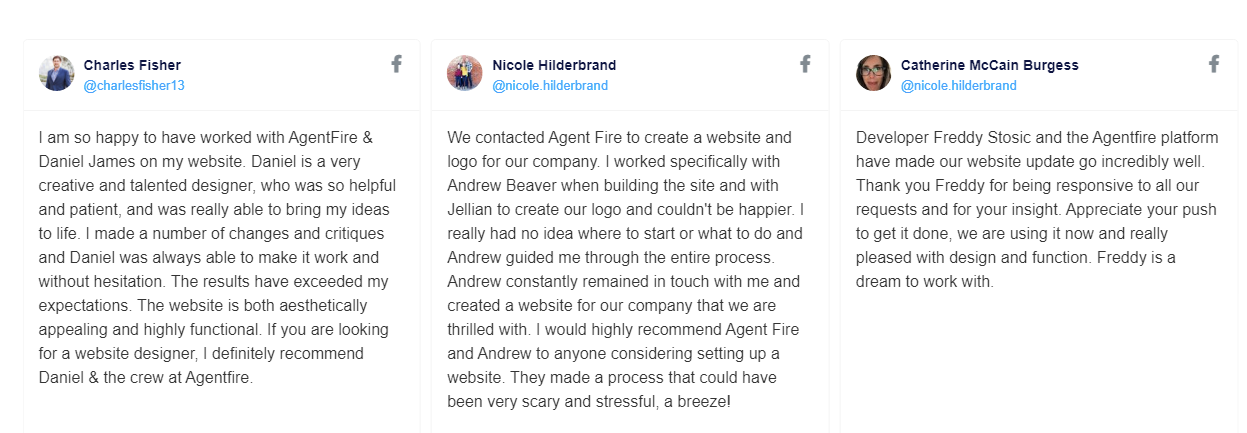
- Direct quotes from client.
- Case studies (or links to case studies).
- Video interviews or testimonials.
- Review scores from sites like Yelp, Google My Business, Facebook.
In order to make social proof work for you, you should keep two best practices to keep in mind.
First and foremost, don’t fake your social proof. Fake social proof may work for YouTube influencers showing “how excited they are about this amazing mobile game”, wink wink, nudge nudge. But in real estate, where buyers are making the largest purchasing decision of their lives, there’s far less tolerance for it. And if people smell shenanigans, you’re going to have a hard time winning back their trust.
In short, only use REAL social proof. If you want to feature a direct quote from a client, make sure you include the client’s real picture and name.
If you wish to include a video testimonial, make sure it covers the what, when, where, who, why, and how of their real estate experience with you.
While getting a real testimonial may take time and effort to put together, it’s always worth the trouble. Always resist the temptation to use fake stock photo clients and fake names.
According to InvespCRO, nearly 90% of consumers trust online reviews as much as personal testimonials and 72% of consumers only take action after they’ve seen a positive review.
7. A Call To Action (CTA)
Your call to action is the backbone of your landing page since this is the mechanism that helps you accomplish your conversion goal.
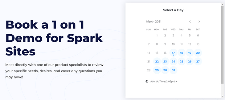
When it comes to CTAs, there are lots of options to choose from. It could be a short form that collects your client’s information, an appointment setting calendar, or a “continue with Google/Facebook” type of button that automatically collects your client’s info.
While we could write an entire article about CTA design, we’re only going to mention three of the most important design elements you should include:
- Avoid boring, overly used buttons with text such as “click here” or “submit.” Instead, use conversational language. If you’re offering a buyer’s guide, you could make the button “take me to the guide.” If you’re requesting their email and full name so you can show them a new, not-yet-on-MLS listing, the button could read “show me the property.”
- If you’re going to use a form, keep it as short as possible, and only ask for the bare minimum.
- Make sure your CTA button stands out from the background and is easy to find. If possible, make sure it’s visible as soon as the visitor arrives at the landing page.
Get Rid of Navigation Elements
Don’t include a navigation bar or links to other pages on your landing page. The only clickable links should be your call-to-action, or the “submit form” button on your landing page.
By limiting your visitor’s navigation options, you increase the likelihood that they will convert, and won’t get distracted by something else. If they wish to leave, they would have to close the window or tab.
How to Get Your Real Estate Landing Page Out There
PPC
PPC advertising is a popular marketing strategy that many real estate agents use to bring eyes to their landing pages. If a prospective buyer types “real estate agents in my city” in a search engine, they may find your buyers landing page as a sponsored result.
Social Media
Using social media to share your landing page can be a bit tricky because you need to deeply know your target audience in order for the advertisements to be effective. Social media platforms such as Facebook and Instagram allow you to target your ideal audience down to their age, location, interests and more.
Your email list subscribers are not inherently your hottest leads. These readers may have become passive to your emails and could use a new type of content to grab their attention. This could also be the push they need to finally give you a call. Keep your email text short and share a link to your landing page (preferably link the image).
Offline Advertising
In your offline marketing materials such as brochures, posters, business cards etc., encourage people to go to a specific and easy-to-remember website. To make it even easier, include a QR code that links to your real estate website home page.
Conclusion
A landing page is an essential part of ANY digital marketing strategy. Make sure you make the most of them with these tips. And if you need an amazing website tailored specifically for real estate marketing AND includes all the landing page construction tools you need, check out AgentFire’s AgentFire Sites, #1 rated for several years in a row.
Want to stay up to date on all of our free and valuable content? Subscribe to our newsletter! We publish valuable articles and guides such as this one regularly. That way you can constantly improve your marketing skills, and become a more effective real estate marketer.
