Who We Serve
Build Your Brand. Showcase Your Value. Grow Your Business.
Unify Your Team. Amplify Your Impact. Grow Your Business.
Explore all features in Overflow, split by workflow steps.
Marketplace
Integrations
Browse trusted experts for PPC, CRM, SEO and more!
Case Study
Broker Owner
Website Type
Headquarters
Team Size
Key Markets
MLS Board
Website
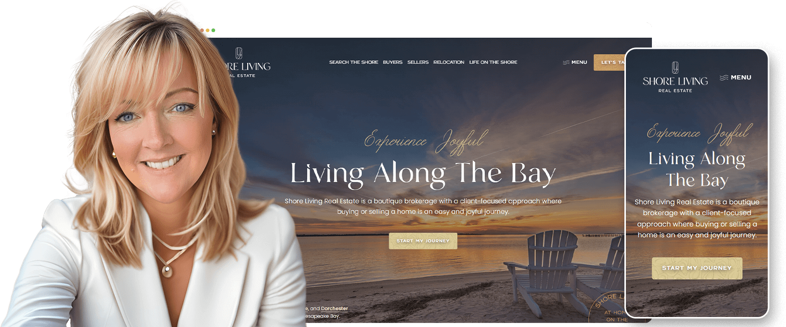
Hello everyone—I’m Nelson Quest, CEO of AgentFire. Join me as we explore the Shore Living Real Estate Website, led by Broker Owner Julie Stephenson. This case study is not just a showcase; it’s packed with actionable insights for real estate professionals aiming for significant growth and a standout website.
And while we’re proud of our work with Shore Living and would be thrilled to collaborate with you, the strategies and principles discussed here are universal, and can be applied regardless of whether or not you partner with AgentFire, or opt for someone else to design your website.
So without further adieu, let’s dive into how strategic web design propelled Shore Living to new heights and how you can do the same!
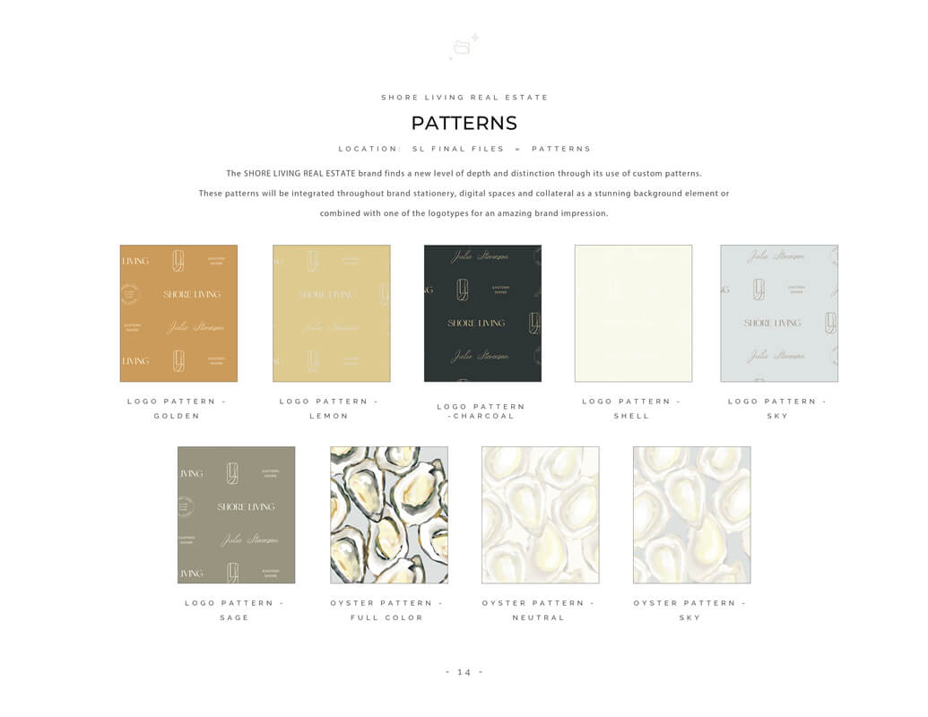
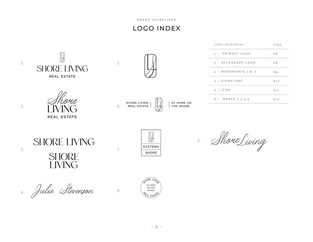
While certainly not required, for agents and teams who understand the importance of, and want to ensure an extremely cohesive brand experience across all of their online presence (website, social media, email marketing) as well as physical presence (business cards, for sale signs etc), a brand guide is highly recommended.
While AgentFire has our own highly regarded branding services, Julie came to us having already created a full Brand & Messaging Guide through her friend Caroline at Blueprint Brand Studio.
“We invested and developed a comprehensive Brand Guide, Voice Guide, and Messaging Guide to ensure our communication is clear and resonates with our target audience. The positive impact on our project is evident in the enhanced clarity and appeal of our brand message, ensuring we stand out in a competitive market.”
The photography used on Julie’s website represents a mix of stock photography (which we sourced through Shutterstock.com), local photography (which Julie sourced from local photographers), and photos that Julie provided (such as team & client photos).
To this end, I wanted to highlight a few important points that I would recommend to anyone evaluating how to best handle the photography to be used on their website:
While stock photos are often very beautiful, in my opinion they are best used in the following use cases:
If you’re in a major market this is often very easy to find high quality photos. If you’re not in a major market, you’re likely better off trying to find photos of neighborhoods / communities / home exteriors & interiors that reflect what is often found in your local market.
So as an example, when creating a ‘Seller’ page, not only should you aim to pack the page with as much information as possible relating to everything that makes you unique, you’ll further want to ‘accent’ this information with photos. As an example, if you offer Drone photography, why not show a photo of an actual drone to accent this point? Long-term, you’ll want to replace these photos with your own high quality photos, but at least initially, aim for high quality stock photography that helps you to ‘paint’ the full picture of what makes you unique (instead of just narrating it).
From my perspective, everything that makes you or your team unique, or showcases value that you bring to the table, should at some point have professional photo(s) to represent it.
These should cover everything of value that you do, and can include:
While stock photos are often beautiful, they can be somewhat ‘generic’ in nature and thus fail to capture the true essence of your local market. In this case, it’s often a good idea to find locally sourced photos. My personal favorite place to find local photos is Flickr.
“We believe that the essence of a home must be captured through a lens that reflects its heart. To achieve this, we partner with local photographers who not only possess technical skill but also a deep understanding of our community and values. This collaborative process ensures that each photograph on our website is not just visually stunning but also emotionally compelling, setting us apart in a market often saturated with generic visuals.”
Here at AgentFire, we’ve got our own always cutting-edge in-house AI tools which we use to generate the written content for every page and section of your website.
With that being said, in order for this content to accurately reflect your ‘brand voice’, or the unique things that you bring to the table for buyers, sellers, relocation, etc… we need inputs from you which we will collect during the initial onboarding phase where you are asked to fill out our onboarding forms.
In Julie’s case, not only did she provide us with great information regarding all of the unique services that she provides, she also provided us with Brand Voice and Brand Messaging, which we were able to use to teach our AI exactly how the content should be written!
The result was truly exceptional written copy for every page and section of her website.
Julie’s decision to partner with AgentFire for her website overhaul was driven by a desire for a fully customized, local-focused design. Starting from our detailed onboarding process, where she filled out forms to provide insights into her preferences and needs, Julie was involved every step of the way.
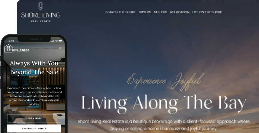
Drawing inspiration from various real estate websites she admired, Julie provided examples during the onboarding phase. This input was crucial for our design team, especially during the initial pre-design consultation with her site’s lead designer. Together, they shaped a vision that would seamlessly blend functionality with local charm, ensuring the website was not only interactive but also intuitively navigable on mobile devices.
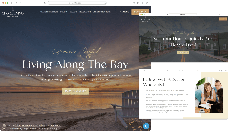
Opting for our comprehensive custom design package, Julie’s new website includes a bespoke homepage and up to 10 tailor-made interior pages. These pages were meticulously crafted to ooze local flavor, cementing her status as a hyperlocal expert. This approach was greatly enhanced by Julie’s brand guide.
The design prominently features her brand’s connection to coastal living with slogans like ‘Living Along the Bay’ and ‘Living on the Shore’. The first draft was almost spot-on, requiring only minor tweaks to perfect the subsequent pages.
“At Shore Living, our website is the digital extension of our core values—integrity, personalized service, and legacy building. Our objective is clear: to not just showcase properties but to narrate the story of community and connection that is fundamental to buying or selling a home on Maryland’s Eastern Shore. AgentFire has empowered us to elevate this platform far beyond a typical realty website, creating an immersive experience that aligns perfectly with our mission to offer more than just real estate services but a pathway to a life well-lived and to set us apart from our local competition!”
Particular focus was placed on the Listing pages (powered by AgentFire’s ‘My Listings’ feature). Inspired by the layout of the Oasis Group Realty site, these pages were designed to function as standalone single-page websites for each listing, complete with videos, 3D tours, floor plans, and more, making them perfect for online marketing campaigns. It was also important that these pages spotlight specific agents from Julie’s team, depending on the listings they represented, adding a personal touch to each property showcased.
Through a collaborative process that leveraged both Julie’s input and our design expertise, AgentFire delivered a website that not only met but exceeded expectations, blending professional design with a deep understanding of the local market.
Julie aimed to elevate her website with lifestyle pages tailored to diverse buyer preferences, linking each to customized IDX listings that feature options like “Retirement Communities,” “Golf Communities,” and “Rural Retreats.”
I want to really stress that while traditional ‘IDX Search’ may struggle against big portals like Zillow, incorporating unique lifestyle or hyperlocal searches can greatly enhance your site. These tailored searches not only cater to specific market preferences but also bolster the perception of you and your team as true hyperlocal expert!
This strategy sets Julie’s website apart and enriches the user experience, aligning property searches with lifestyle choices and showcasing the impact of customized web design in the real estate industry.
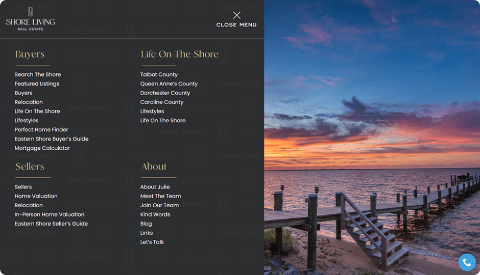
Julie appreciated the simple dropdown menu structure inspired by the Oasis Group website, emphasizing ease of navigation with clear, straightforward options that adapt seamlessly on mobile devices. To enhance this, we designed a fresh-looking mega menu for her site, showcasing all links against the backdrop of a stunning waterfront photo. This approach combines functionality with aesthetic appeal, ensuring a user-friendly and visually engaging experience.
The success of Julie Stephenson’s website at Shore Living Real Estate is a testament to the power of detailed understanding, open communication, and a shared commitment to excellence. Through a deep dive into her preferences and continuous collaboration, we crafted a website that not only mirrors her brand’s ethos but also significantly enhanced & grew her business!
If you’re ready to elevate your real estate brand, why not book a demo with AgentFire? In 30 minutes or less we can discuss your goals, answer any questions you have, and explore the features and overall experience that has made AgentFire the #1 overall rated real estate solution year after year!
With over 1000 reviews on Facebook and Google, join the thousands of agents and teams who trust AgentFire to help power their success online.
This website uses cookies so that we can provide you with the best user experience possible. Cookie information is stored in your browser and performs functions such as recognizing you when you return to our website and helping our team to understand which sections of the website you find most interesting and useful.
Always Active
These cookies are necessary for the website to function and cannot be switched off. They are usually only set in response to actions made by you such as setting your privacy preferences, logging in or filling in forms.
You can set your browser to block or alert you about these cookies, but some parts of the site will not then work. These cookies do not store any personally identifiable information.
This website uses Google Analytics to collect anonymous information such as the number of visitors to the site, and the most popular pages.
Keeping this cookie enabled helps us to improve our website.
More information about our Privacy Policy
AgentFire
We firmly believe that the internet should be available and accessible to anyone, and are committed to providing a website that is accessible to the widest possible audience, regardless of circumstance and ability.
To fulfill this, we aim to adhere as strictly as possible to the World Wide Web Consortium’s (W3C) Web Content Accessibility Guidelines 2.1 (WCAG 2.1) at the AA level. These guidelines explain how to make web content accessible to people with a wide array of disabilities. Complying with those guidelines helps us ensure that the website is accessible to all people: blind people, people with motor impairments, visual impairment, cognitive disabilities, and more.
This website utilizes various technologies that are meant to make it as accessible as possible at all times. We utilize an accessibility interface that allows persons with specific disabilities to adjust the website’s UI (user interface) and design it to their personal needs.
Additionally, the website utilizes an AI-based application that runs in the background and optimizes its accessibility level constantly. This application remediates the website’s HTML, adapts Its functionality and behavior for screen-readers used by the blind users, and for keyboard functions used by individuals with motor impairments.
If you’ve found a malfunction or have ideas for improvement, we’ll be happy to hear from you. You can reach out to the website’s operators by using the following email
Our website implements the ARIA attributes (Accessible Rich Internet Applications) technique, alongside various different behavioral changes, to ensure blind users visiting with screen-readers are able to read, comprehend, and enjoy the website’s functions. As soon as a user with a screen-reader enters your site, they immediately receive a prompt to enter the Screen-Reader Profile so they can browse and operate your site effectively. Here’s how our website covers some of the most important screen-reader requirements, alongside console screenshots of code examples:
Screen-reader optimization: we run a background process that learns the website’s components from top to bottom, to ensure ongoing compliance even when updating the website. In this process, we provide screen-readers with meaningful data using the ARIA set of attributes. For example, we provide accurate form labels; descriptions for actionable icons (social media icons, search icons, cart icons, etc.); validation guidance for form inputs; element roles such as buttons, menus, modal dialogues (popups), and others. Additionally, the background process scans all the website’s images and provides an accurate and meaningful image-object-recognition-based description as an ALT (alternate text) tag for images that are not described. It will also extract texts that are embedded within the image, using an OCR (optical character recognition) technology. To turn on screen-reader adjustments at any time, users need only to press the Alt+1 keyboard combination. Screen-reader users also get automatic announcements to turn the Screen-reader mode on as soon as they enter the website.
These adjustments are compatible with all popular screen readers, including JAWS and NVDA.
Keyboard navigation optimization: The background process also adjusts the website’s HTML, and adds various behaviors using JavaScript code to make the website operable by the keyboard. This includes the ability to navigate the website using the Tab and Shift+Tab keys, operate dropdowns with the arrow keys, close them with Esc, trigger buttons and links using the Enter key, navigate between radio and checkbox elements using the arrow keys, and fill them in with the Spacebar or Enter key.Additionally, keyboard users will find quick-navigation and content-skip menus, available at any time by clicking Alt+1, or as the first elements of the site while navigating with the keyboard. The background process also handles triggered popups by moving the keyboard focus towards them as soon as they appear, and not allow the focus drift outside it.
Users can also use shortcuts such as “M” (menus), “H” (headings), “F” (forms), “B” (buttons), and “G” (graphics) to jump to specific elements.
We aim to support the widest array of browsers and assistive technologies as possible, so our users can choose the best fitting tools for them, with as few limitations as possible. Therefore, we have worked very hard to be able to support all major systems that comprise over 95% of the user market share including Google Chrome, Mozilla Firefox, Apple Safari, Opera and Microsoft Edge, JAWS and NVDA (screen readers).
Despite our very best efforts to allow anybody to adjust the website to their needs. There may still be pages or sections that are not fully accessible, are in the process of becoming accessible, or are lacking an adequate technological solution to make them accessible. Still, we are continually improving our accessibility, adding, updating and improving its options and features, and developing and adopting new technologies. All this is meant to reach the optimal level of accessibility, following technological advancements. For any assistance, please reach out to
Build Your Brand. Showcase Your Value. Grow Your Business.
Browse trusted experts for PPC, CRM, SEO and more!
Limited Sale
Thrive in 2025 with our Biggest Sale of the Year! Get 20% OFF ANY Custom Design Package – Limited Time Only!