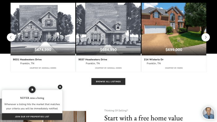
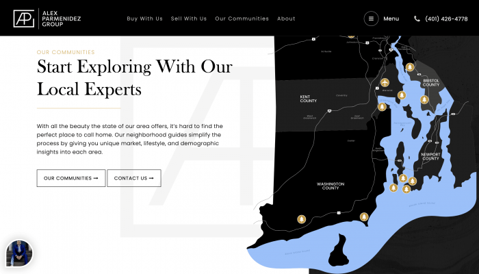
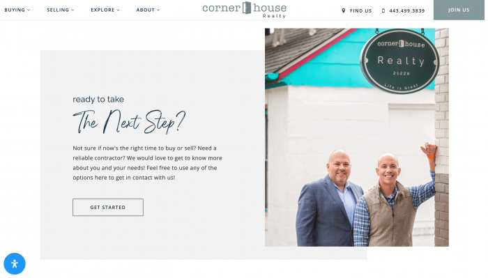
Your CTAs are small but powerful elements of your real estate website. The right CTA can bring potential clients into your lead funnel.
Technology
What is a Call to Action (CTA)?
A Call-to-Action (CTA) is a short piece of content that combines smart design and copy with smart placement to lead viewers to a certain action.
Without a clear call to action, your real estate website will have a hard time moving viewers through your lead funnel and building up your prospective client list.
What Makes a Good Real Estate CTA?
Think about any pop-ups or special offers you’ve encountered while browsing online: “Join our newsletter and get a discount” or “Register with us to read this article.” Which CTAs enticed you and which ones annoyed you?
The best real estate CTAs seamlessly catch your attention, don’t ruin your reading experience, and are very action-oriented. A short, clear CTA has the power to begin a lifelong client relationship.
Purchasing or selling real estate is a life-changing decision, so your CTAs should always link to a longer lead funnel with the intent of gaining a new buyer or seller client. Consider the overall goals of your real estate business.
Clear Intent
Before you start drafting your CTA ask yourself: what do I want my website visitors to do? For example, if you are primarily looking to attract buyers, make sure your website is set up to offer helpful resources to buyers. For example, you can include a CTA that pops up on your home page with the text, “Download our buyer’s guide now,” which prompts visitors to share their email in exchange for your guide.
Most real estate agents have similar career goals, so look at the websites of real estate agents that inspire you. What CTAs are they using and do they entice you? Why?
High Value
What do your visitors get in exchange for following your CTA? Visitors will need an incentive to perform whatever action you have laid out for them. Effective calls to action are equal exchanges of value to the client and lead generation for the agent.
Exclusivity
People naturally want what they can’t have. Exclusivity sparks a sense of urgency and curiosity that leads to faster action. Exclusivity can come in the form of limited products/services or exclusive discounts.
Urgency
As a real estate agent, you know a thing or two about the power of urgency. Calls to action that emphasize a short-term giveaway or deal are great tools to push clients who are hesitant to take the step.
Simplicity
Clarity is priority. Calls to action should be short and clear, precisely outlining what you want your viewers to do and what you are offering in exchange. While it’s important that text reads nicely, prioritize being direct by using action words. For example, subscribe, register, sign up, and share.
Specific words and action phrases emphasize decision, energy, and movement. Pull from this list when your CTA needs a bit of a punch:
- Hurry
- Quickly
- Start access
- Comment
- Share
- Visit
- I’m in
- Get it for free!
- Get me a house!
- I’m ready to find my dream home!
Remember that your client probably isn’t a real estate professional, so keep the industry talk to a minimum.
Optimized for Mobile Devices
A large majority of your prospects will visit your website on their mobile devices. While it’s important that every element on your website is mobile-friendly, your CTAs are especially important. If your CTA doesn’t load properly on mobile, you’ll miss the opportunity to bring a client into your lead funnel.
Strategic Placement
Interactive and valuable CTAs should be posted throughout your web pages and digital, interactive marketing materials. For example, place CTAs on landing pages, your IDX page, and your social media profiles.

Segment Your CTAs by Audience
Most real estate agents have several different client profiles (such as buyers and sellers, people who are looking for their first home, clients looking to downsize after divorce, etc.). Consider making different CTAs for each of these groups. On your real estate website, use your web pages to guide your CTA content.
In PPC advertising and some social media networks, it’s possible to carefully divide your audience by demographics, interests, geographical location, and more. Within these PPC or social media ads, it will be much easier to target specific clients with strategically written CTA, which can be written with exclusive offers only for that particular audience and using terms that are most familiar to them.
Multi-Level CTA Strategy
Effective guides use a hierarchy of CTAs to capture leads at different commitment levels:
Primary CTAs: Your main conversion goal (consultation, listing appointment)
Secondary CTAs: Lower-commitment options (download additional resources, join newsletter)
Micro-CTAs: Engagement boosters (share, save, bookmark)
For example:
- Primary: “Schedule Your Staging Consultation”
- Secondary: “Download Our DIY Staging Checklist”
- Micro: “Save This Guide for Later”
This approach captures readers regardless of where they are in their decision-making process.

CTA Strategy for Buyer’s vs. Seller’s Guides
The most effective real estate guides tailor their call-to-action approach based on whether they’re targeting buyers or sellers, as each audience has distinct needs and decision-making processes.
Buyer’s Guide CTAs
Buyers are typically in an information-gathering mode, focused on education and exploration. Your CTAs should reflect this journey:
Early-Stage CTAs (Awareness):
- “Download the First-Time Buyer’s Checklist”
- “Get Pre-Approved in 15 Minutes”
- “See What You Can Afford”
Mid-Stage CTAs (Consideration):
- “Compare Neighborhood Schools & Amenities”
- “Schedule a Buyer Consultation”
- “View Homes in Your Price Range”
Decision-Stage CTAs (Ready to Act):
- “Start Your Home Search Today”
- “Get Connected with a Buyer’s Agent”

Seller’s Guide CTAs
Sellers are typically more action-oriented, focused on valuation and market positioning:
Early-Stage CTAs (Awareness):
- “Get Your Free Home Valuation”
- “Download the Seller’s Market Report”
- “See What Similar Homes Sold For”
Mid-Stage CTAs (Consideration):
- “Schedule a Listing Consultation”
- “Get Your Home’s Marketing Plan”
- “Compare Agent Commission Rates”
Decision-Stage CTAs (Ready to List):
- “List Your Home with Us Today”
- “Get Your Professional Photos Scheduled”
CTA Placement in Guides
Unlike website CTAs, guide CTAs should be strategically placed at natural reading breaks:
- Section endings: After providing valuable information
- After problem identification: When you’ve highlighted a pain point
- Before and after case studies: To capture interest at peak engagement
- In the conclusion: With your strongest, most compelling offer
Design and Colors
Working with a real estate website designer will make sure that your calls to action are placed properly and frequently throughout your digital marketing content.
As an observer, you’ll notice that every great CTA has certain qualities that make them stand out and be efficient.
The CTA Link
The link or text box that you want clients to utilize should be easy to spot among other elements within your CTA. The goal is for this area to be the easiest and clearest to identify.
High-Quality Visuals
Aesthetically pleasing and professional-looking themes increase click-through rates exponentially. Work with your designer to choose your brand colors and work them into your CTA designs. When appropriate, include a professional photo within a reasonable size.
Buttons
Graphic buttons are a powerful element within your CTA design that should stand out in your design. Make sure that your CTA buttons are created by a professional who understands graphic design and marketing. Your designer will choose a button design that is attention-grabbing, has the right contrasting colors, and is the best size to appeal to your clients.

Testing and Optimizing Your CTAs
Even the best-designed CTAs need continuous optimization to maximize their effectiveness.
A/B Test Your CTAs
Test different elements systematically:
- Copy variations: “Get Your Free Valuation” vs. “See What Your Home is Worth”
- Button colors: Test high-contrast colors against your brand palette
- Placement: Above the fold vs. after key content sections
- Offer types: Free consultation vs. downloadable resource
Track Key Metrics
Monitor these performance indicators:
- Click-through rates: Which CTAs get the most engagement
- Conversion rates: Which leads to actual appointments/listings
- Guide completion rates: Are CTAs interrupting the reading experience?
- Lead quality scores: Are CTAs attracting your ideal clients?
Integrate Social Proof
Enhance CTA effectiveness by adding trust elements:
- “Join thousands of satisfied sellers who got top dollar”
- Include brief testimonials near your CTAs
- Add trust badges or certifications
- Show recent success stories
Example: Instead of just “Schedule Your Consultation,” try “Schedule Your Consultation (Most of our clients sell within 30 days)”
What Should You Avoid in Your CTAs?
These CTA mishaps may seem obvious, but they often go under the radar:
- Beautiful design with an unclear call to action: The goal is to start a ripple effect of action that builds a great agent-client relationship. Clear instruction is critical.
- Your CTAs are boring: Many of your visitors have seen the same CTAs on other websites. Without sacrificing clarity, try to ensure that your CTAs grabs your visitor’s attention, making the likelihood of engaging higher.
- Your real estate marketing doesn’t appeal to the visitor: Think about what you can do for your web visitors and not the other way around. What can you offer clients in exchange for their contact information? This will clarify what your CTA should communicate.
Conclusion
Our AgentFire designers are CTA masters who know exactly how to build CTAs to attract your ideal clients. Although you could do it yourself, not all of us are wordsmiths and professional web designers. You’ve worked hard to attract the right clients and obtain the perfect real estate site. The last thing you want to do is reuse the most common CTAs without making them your own.
Work with an AgentFire web designer to implement the right calls to action with the perfect text, design, and placement. Whether or not you decide to go it alone, as a real estate agent, it is important to understand how these elements work on your powerful real estate website.
If you want more in-depth articles, tactics, strategies, and advice, subscribe to our blog. And if you want to dominate your hyperlocal real estate market, check out AgentFire’s Web Designs, highly rated for several years in a row.

