Think of your website like a net. The more holes you have, the more fish (leads) are going to slip through. So where will you find the holes in your real estate website design?
Hyperlocal Strategies
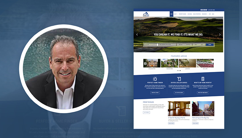
Today I want to take you through the steps we took to completely flip Ed Eakin’s real estate website design.
When Ed contacted us, his site was a fixer-upper. It wasn’t generating leads, had poor mobile performance and didn’t look that nice from a design standpoint. The crazy thing is he was spending tons of money to drive traffic… But it wasn’t capturing any leads.
This is a problem many realtors and brokerages tell us about before switching to AgentFire. They spend big money on advertising or lead generation platforms and get no results.
Where Real Estate Websites Fall Short
Imagine you went on a fishing trip. On this trip, there were two rivers. Your friend took River A, and you took River B.
River B has a ton more fish flowing through it than River A. You know you’re going to catch significantly more. But at the end of the day, you barely caught any fish. Your friend, however, walks away with several buckets full.
Why did this happen?
Upon further examination, you realize your net has a bunch of holes in it… Your friends net is tight and secure.
Think of your website like a net. The more holes you have, the more fish (leads) are going to slip through. So where will you find the holes in your real estate website design?
Real Estate Website Design & User Experience
Your site is going to lose people if it’s slow, doesn’t work well on mobile etc.
Design and structure are super important. If your site doesn’t look professional you won’t be taken seriously. And if it’s hard to navigate your bounce rate will go through the roof. (Every additional second of load time equals 7% loss of conversion)
Keeping people around long enough so they explore and consume your content is the first step to generating more leads.
Providing Value
This is where many realtors and brokerages make a big mistake. They treat their website as a machine for generating leads.
You should look at your website as an outlet to exchange value. IE: Your expert advice and information in exchange for your leads’ contact information. Provide them value with your content and get value back in the form of permission to market more and potentially earn their business.
If you’re interested, here’s a guide to creating awesome content.
Utilizing Effective CTA’s
We cover this more in-depth in our article about generating leads with a real estate website. The bare essential is creating a consistent and targeted marketing message.
Apply your marketing message site-wide using conditional CTA’s, lead magnets and content. This content is where you can provide value and make a juicy offer to your visitors in exchange for their info.
So what does this look like in the real world? Well, let’s take a look at what Ed’s site looked like before and after.
The Real Estate Website Design Before & After
I am going to take you through 3 different pages to illustrate the important bases to cover in your real estate website design. But before I do… I just want you to understand the thought process that goes into design.
Put yourself in your potential clients’ shoes for a moment. They’re looking online for advice or a realtor to help them buy or sell a home. This person has never met you before. By chance, they stumble upon your site (but this isn’t really ‘chance’ if you’re doing SEO).
They look around your website for 10 seconds or so looking for any reason to stay…
Option A
They start poking around your site and think to themselves… “I can’t really tell what Jane does.” and “Where do I go first?” They go to click on your blog and before that can even happen, they’re hit with a box that says “Get Updates, ENTER YOUR EMAIL”. They think to themselves, “updates for what?” They even have a hard time closing the box that’s asking them to enter their email. At this point, they are frustrated, don’t understand what value they are going to get by sticking around your site and leave.
Option B
They start poking around your site and think to themselves …”Wow, this is a really nice site, okay so Jane specializes in waterfront homes in Orlando.” As they scroll down, they’re hit with a few more pieces of info talking about waterfront homes in Orlando. This gets them curious, so they click onto a blog called “Why Buy Investment Property in Orlando” from your home page. They read 3/4 through the article and a box pops-up “Investors We’ve Worked With Have Made 20% Yearly Returns in Orlando. Want to Learn More? Let’s talk!”. They click the call-to-action and schedule a phone call about investing.
Think about how you’d want to be sold
How often do you get an ad for something and say “What the heck? Why would I want this?” Sometimes advertisers are ruthless too. There was one particular company that we didn’t have any use for that kept hitting me up every other day until I finally blocked them…
I appreciate the hustle, but spam is spam.
If you want to get in touch with more leads, you have to have a reason. Having a generic website that forces people to enter their info is spam. Creating a targeted resource page that educates and provides value to your market is not.
Options A and B above are very real examples. If you want to have a website like option B, keep reading.
Designing Your Home Page
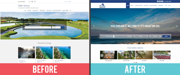
Your home page is your landing page. Use it to lead your visitors from discovering your website to discovering who you are.
Don’t make it super complicated. Just give your best elevator pitch. “Hi, I’m Jane. A realtor in Orlando specializing in luxury waterfront homes.”
If you’re producing content for your blog, have it featured prominently on your home page. This helps show your website visitors that you’re active in the community and knowledgeable. In just a couple seconds you can build trust and authority.
Additional Tips:
- If you’ve been featured in the local or national press, use an “as seen on” banner
- A fantastic testimonial(s) on your homepage is powerful social proof
- Great design starts by removing clutter and simplifying
As you can see by the before and after example above, many of the site elements are similar. It’s just organized and styled better. The keys to a professional looking site are beauty and simplicity.
Now lets move onto styling your CTA’s.
Designing Your Call-To-Action
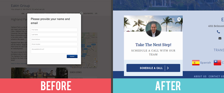
Remember how I mentioned creating a consistent marketing message?
Well, The Eakin Group specialize in estates and villas in tropical destinations throughout South America. Notice the Palm Trees in their logo and on the CTA? The colors, photos, and font across their new website are hand-picked to match the “feel” of the brand they represent.
They also have a much stronger call-to-action. It targets someone who wants to move forward and consult with a realtor.
Granted, it doesn’t target a buyer or seller. This CTA is on the home page and thus doesn’t allow us to target that way… However, we do set up these “conditional” CTA’s across their site using buyer and seller guides to incentivize sign-ups.
More information on this in our guide to generating leads with a real estate website.
Setting Up Property Search
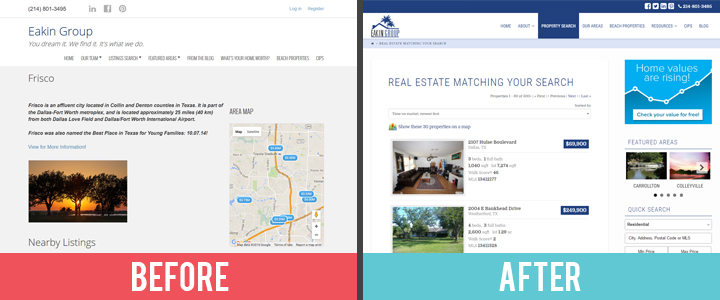
We don’t actually have much control over this part of the design as we work with 3rd party solutions (and so will you). This means we have to be selective when deciding who we work with.
If you’re looking to set-up property search on your site that looks amazing out of the box, you can’t go wrong with Showcase IDX. We also work with iHomeFinder and DiverseSolutions which are good and offer coverage for almost all of the US and a good amount of Canada.
Property search can be valuable for your visitors and great for lead capture. Make sure you get it set up on your site. Also, notice how we have a call-to-action on the right-hand side of the screen? This is a nice seller-lead capture tactic.
If you’re interested in taking a full tour of our websites to see how we design for user experience and lead capture, just check out our portfolio. Go ahead and steal some design ideas.
In Conclusion
I hope showing you the thought process behind how we design our sites is helpful. It’s easy to tell you what to do, but not always simple to explain why you should do it.
If you want to build a site that’s optimized for leads, it has to be optimized for the user experience first. Make it beautiful and easy to navigate. Then, provide value in the form of content. If you want your visitors to take action, you have to be clear and make sure you’re targeting the right people.
Great design in your CTA’s and authority building elements like prominent testimonials will help ensure you generate leads. Just be consistent in your marketing and it will all come together.
…
What was your favorite tip in this article? How are you going to apply these design ideas to your own real estate website? Let us know in the comments!
